SO YOU · WEBSITE UPGRADE
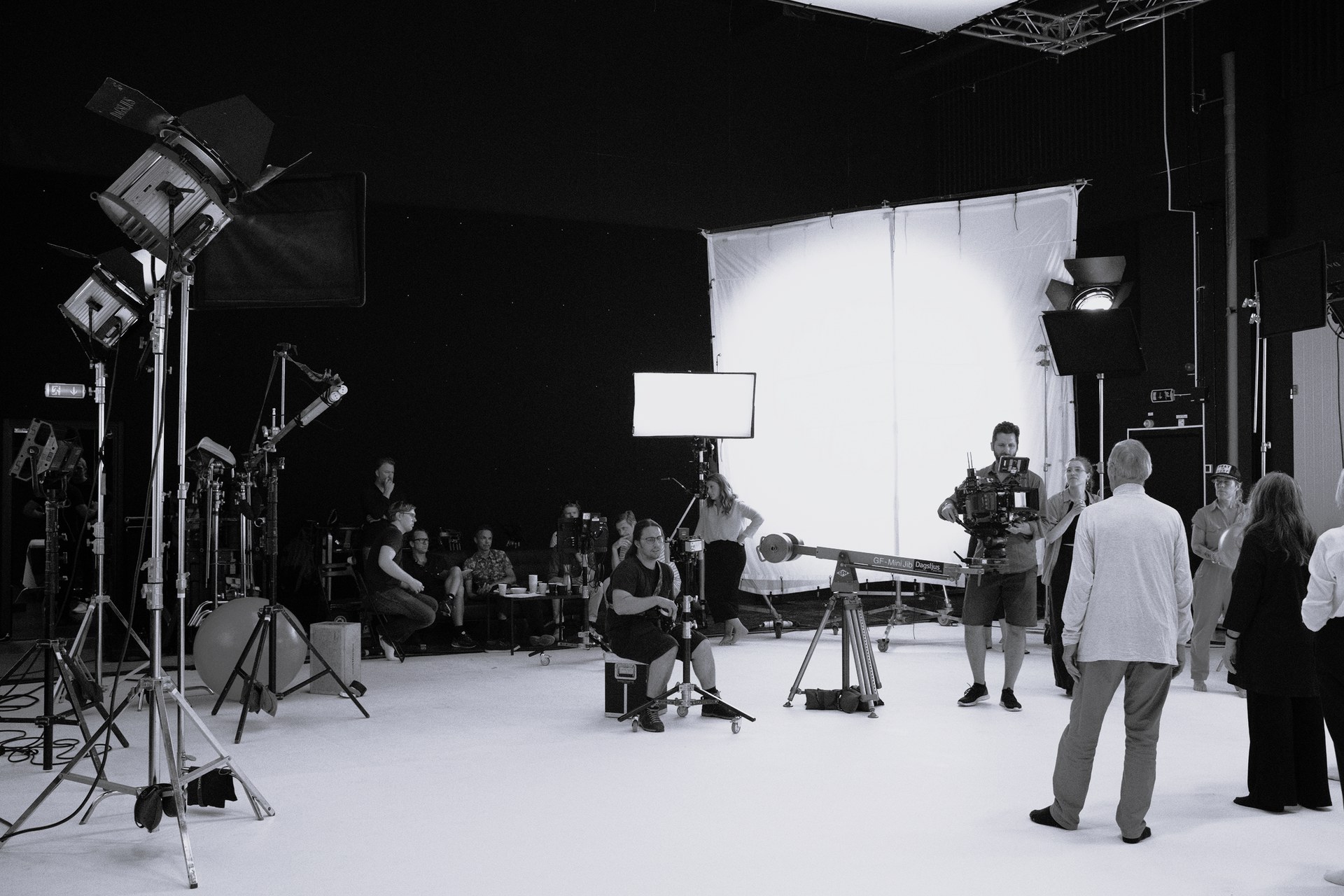
Made for you.
Built around you.
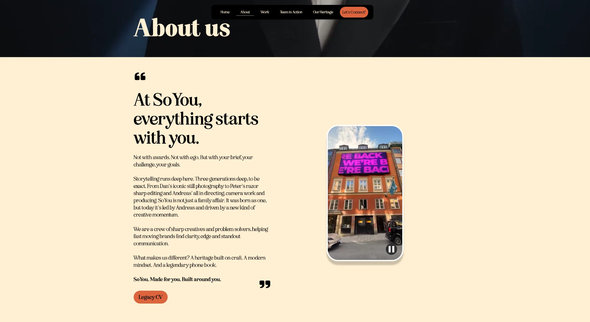
So You is a hybrid agency and production house based in Stockholm, specializing in a diverse array of media and communication services. The website upgrade focused on storytelling, information architecture and interactive design — making it instantly clear what the studio does and helping visitors find their way.
Project overview
- Sector
- B2B · Hybrid agency & production house
- Scope
- Website upgrade · Storytelling · IA & Navigation
- Process
- Wireframing · Prototyping · Interactive design
- Location
- Stockholm
UX RESEARCH
Challenges & solutions
01
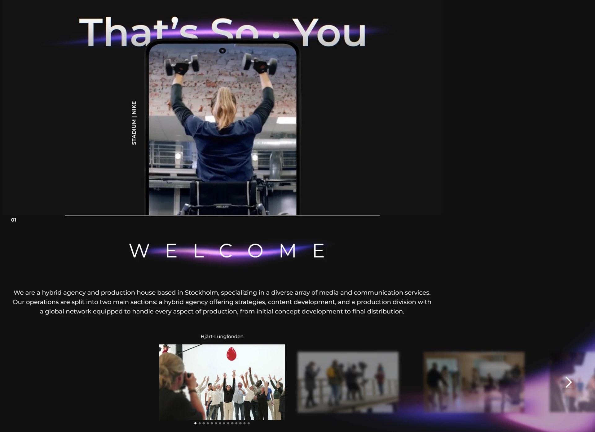
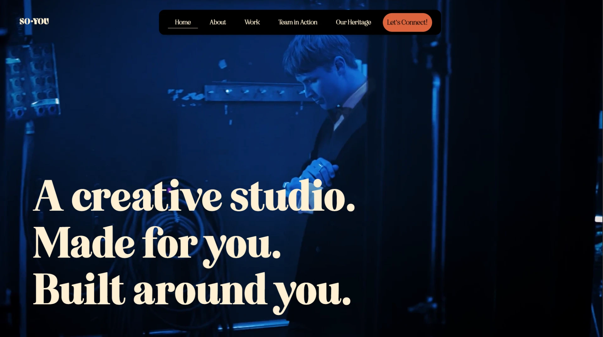
Initial impression & value proposition
- Challenge
- The hero section lacks immediate clarity. Users must read a smaller paragraph below the fold to understand it is a hybrid agency and production house.
- Solution
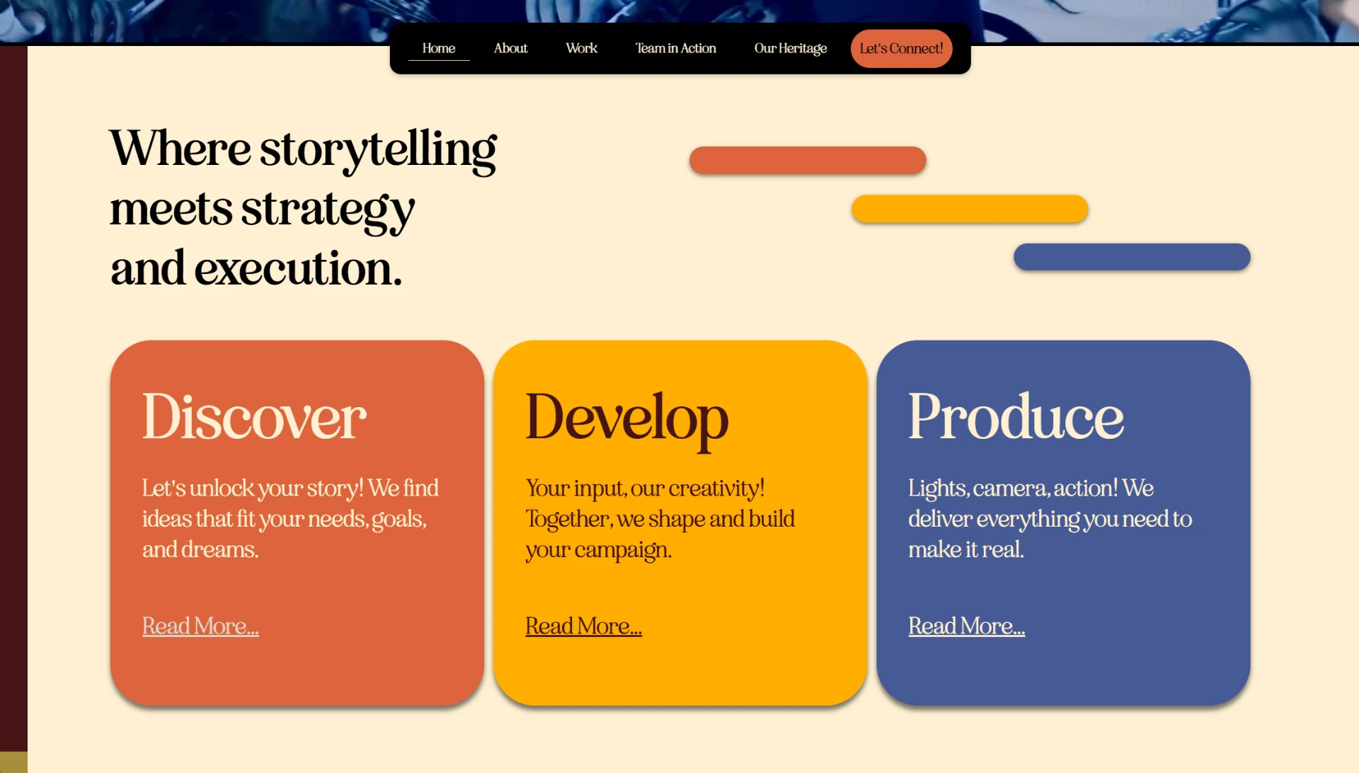
- Introduce a clear, punchy sub-headline directly beneath the main hero text that explicitly states what the company does — “A creative studio. Made for you. Built around you.” — followed by a clear scheme of their process.
02
Navigation & wayfinding
- Challenge
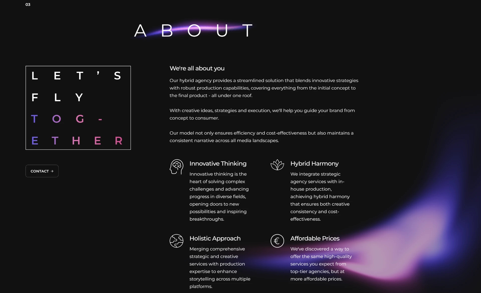
- The full-page view reveals a very long, single-page scroll layout with no persistent navigation, making it difficult for users to jump directly to “Services” or “Contact”.
- Solution
- Implement a sticky top navigation bar with anchor links to key sections (Home, About, Work, Team In Action, Our Heritage, Let’s Connect) so users can orient themselves and bypass content they don't need.
03
Readability & text density
- Challenge
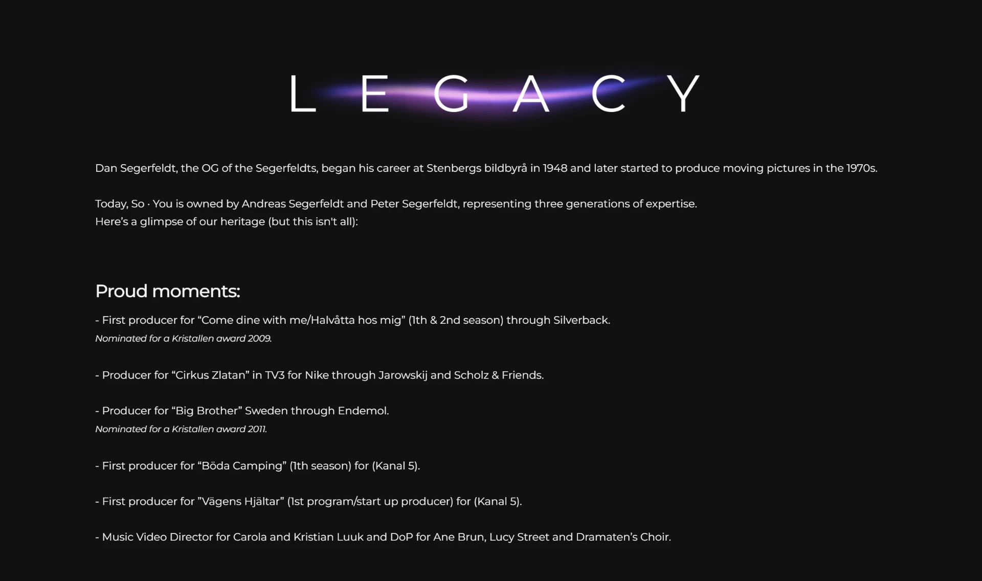
- Sections like “Legacy” and “Welcome” feature wide lines of text. On a dark background, long unbroken blocks of white text cause eye strain and lower reading comprehension.
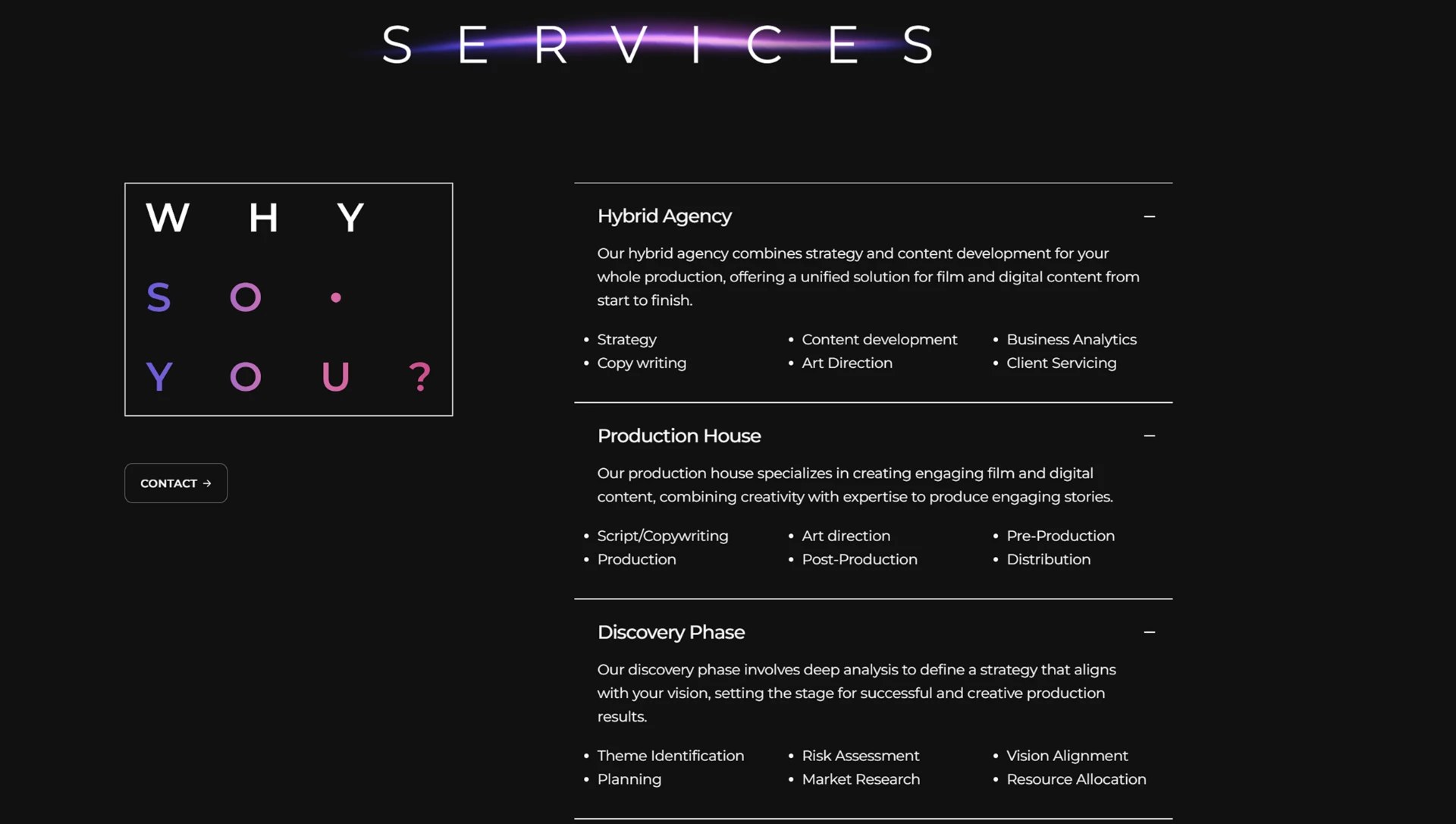
- Solution
- Constrain the maximum width of text blocks (ideally 50–75 characters per line). For the “Legacy” section, convert the history into a visual timeline or distinct, scannable cards rather than a text wall.
PROCESS
From research to release
Research & discovery
Understanding users, business goals and the existing experience.
UX & wireframing
Mapping flows and structure before a single pixel is styled.
Brand identity
A collaborative team effort — carried into every screen.
UI design
Translating the identity into a calm, editorial interface.
Prototype & finalization
Testing, refining and preparing the handover to development.
ART DIRECTION
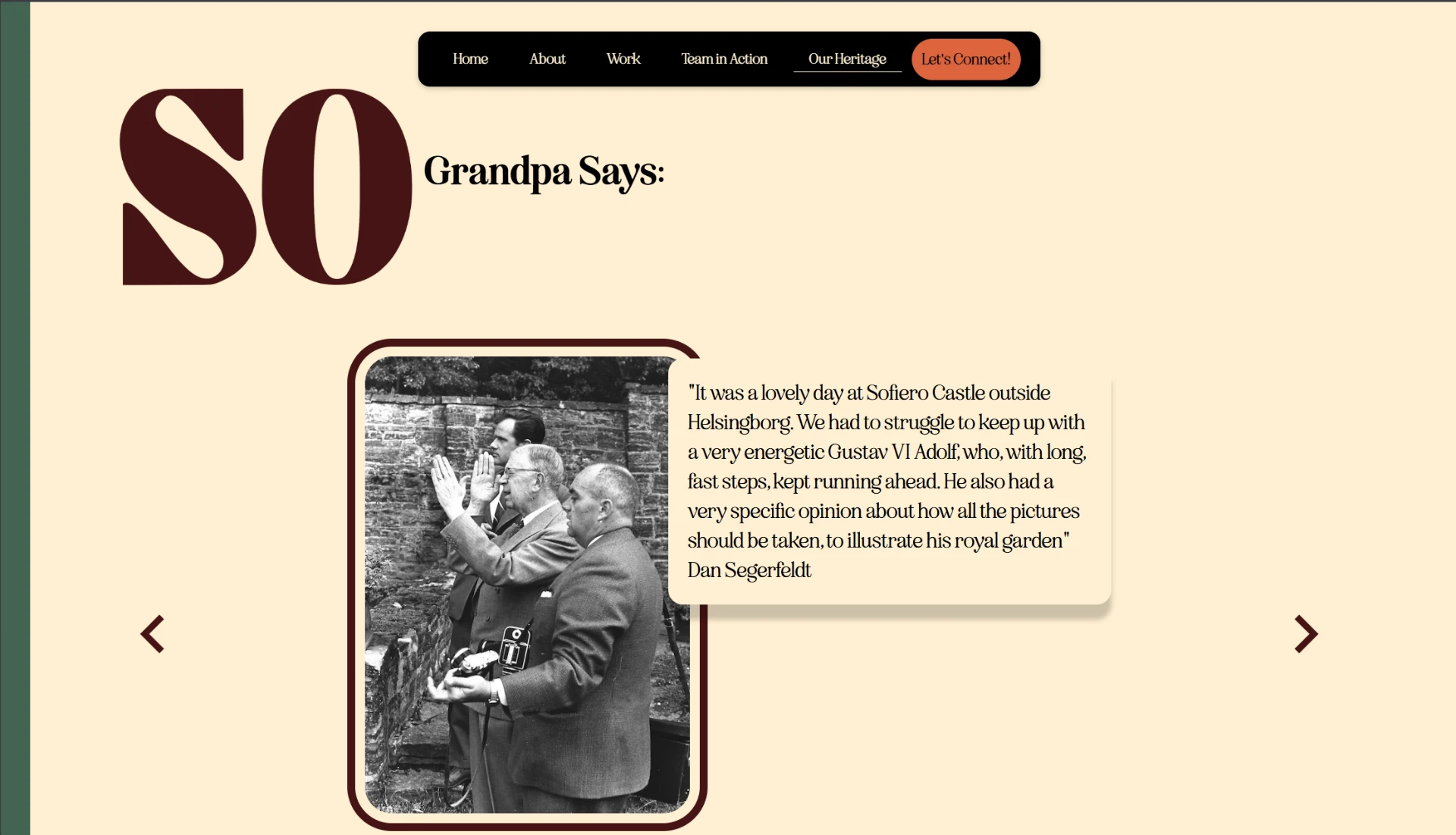
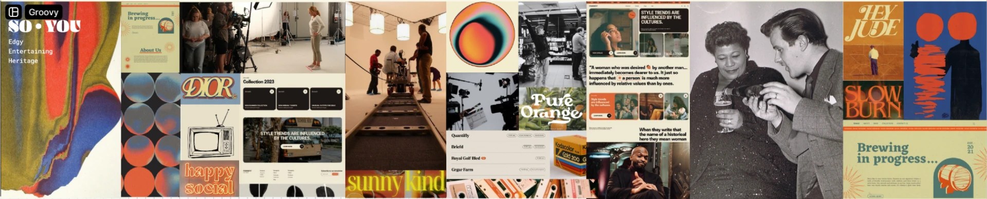
Edgy, entertaining, heritage.
The visual direction leans into the studio's own character — edgy, entertaining and rooted in heritage. A retro palette of yin blue, flame orange and papaya whip sits against deep raisin black, carried by bold serif wordmarks, playful repetition and grainy, editorial photography. The result feels like a broadcast archive reimagined: warm, loud and unmistakably So You.
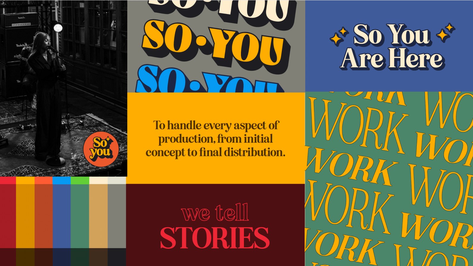
A note on credit: the brand identity itself is a collaborative team effort — my role was carrying it into the website experience so the digital product stays true to the brand.
OUTCOME