JOBSAFE · INFOBRIC · CHECKOUT OPTIMIZATION

Safer training,
smoother checkout.
Jobsafe by Infobric is a B2B e-commerce platform providing smooth and safe training for workers within the construction industry — with courses available online, remotely, or through practical sessions. The work covered a website upgrade, checkout optimization design, information architecture and navigation, and the presentation of product information.
Project overview
- Client
- Jobsafe by Infobric
- Sector
- B2B E-commerce · Construction training
- Scope
- Website upgrade · Checkout optimization
- Focus
- IA & Navigation · Product information
UX RESEARCH
Shifting Perspective
CHALLENGES
- 01
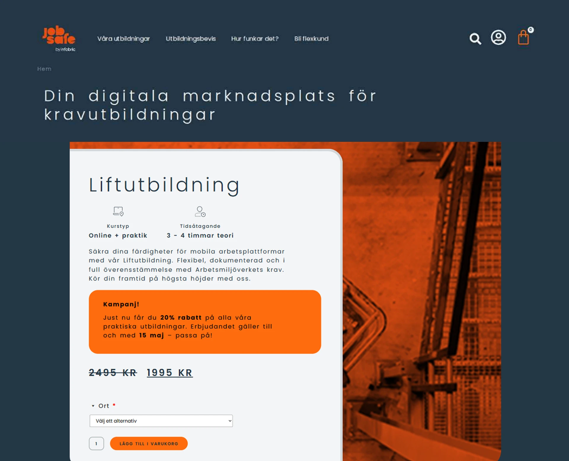
Optimized above-the-fold experience
On the product listing page, critical course information and CTAs were placed too far down, forcing users to scroll before understanding the value proposition.
- 02
Campaign messaging complementing the CTA
The large orange campaign box on the landing page hero drew too much attention, distracting users from the primary call-to-action.
- 03
Adding Submenu for better engagement
Click analysis showed users skimmed only the first two steps and the last one, missing important details in between.
Long and distracting checkout flow
- Challenge
- The checkout page was too long, forcing users to scroll extensively, which caused fatigue and drop-offs. The form took most of the focus, while the order summary was overlooked.
- Solution
- Redesigned the layout using the full page width — placing the form and a visual order summary side by side. Added an adjustable summary and a carousel of related courses to encourage upsells while keeping the process fast and intuitive.
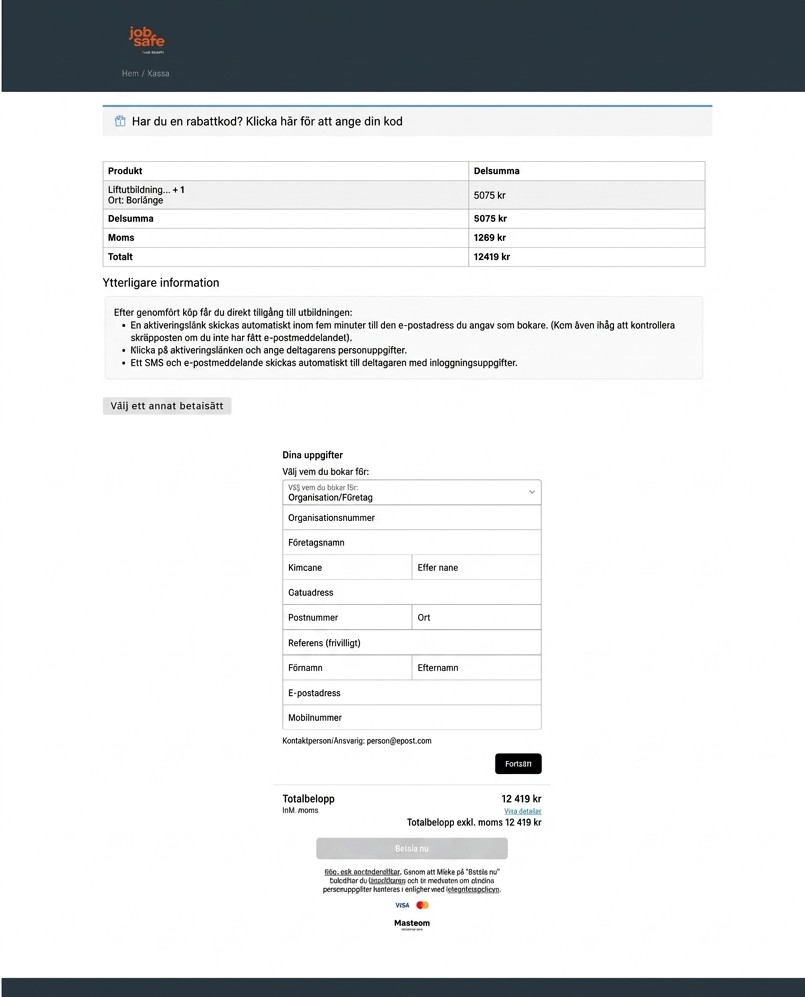
Showing the before checkout page, 1 of 2.
STEP-BY-STEP GUIDE
PLP UX Improvements
Use clear imagery, consistent categorization and intuitive filters to help users navigate the page easily and maintain engagement beyond the fold.
Improve visual clarity
Use clear imagery, consistent categorization and intuitive filters to help users navigate the page easily and maintain engagement beyond the fold.
Let users control how many courses they explore, encouraging further discovery without overwhelming them.
Add a “Show More” button
Let users control how many courses they explore, encouraging further discovery without overwhelming them.
Place campaign ads within the course grid to keep promotions visible without distracting from course discovery.
Integrate campaign messaging subtly
Place campaign ads within the course grid to keep promotions visible without distracting from course discovery.
Provide clear visual feedback when a course is added to the basket, helping users track their choices and stay engaged in the purchasing journey.
Visualize basket interactions
Provide clear visual feedback when a course is added to the basket, helping users track their choices and stay engaged in the purchasing journey.
Break up visual repetition, create a more dynamic browsing experience and make courses more enjoyable to scan.
Use an alternating 4–3 grid layout
Break up visual repetition, create a more dynamic browsing experience and make courses more enjoyable to scan.
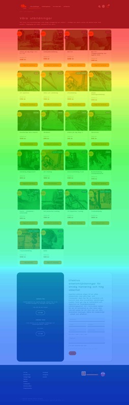
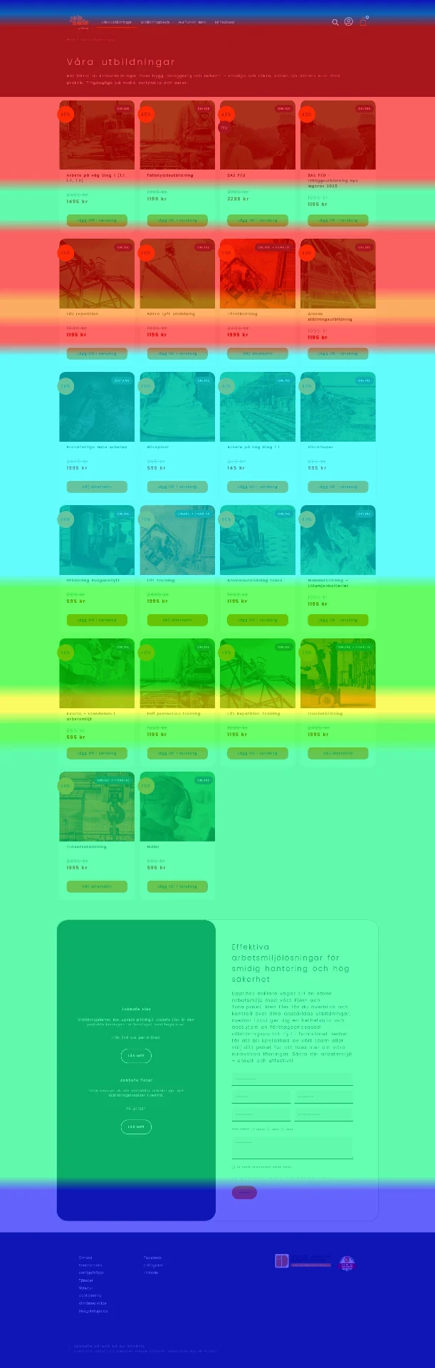
Showing the previous scroll map mockup, 1 of 4.
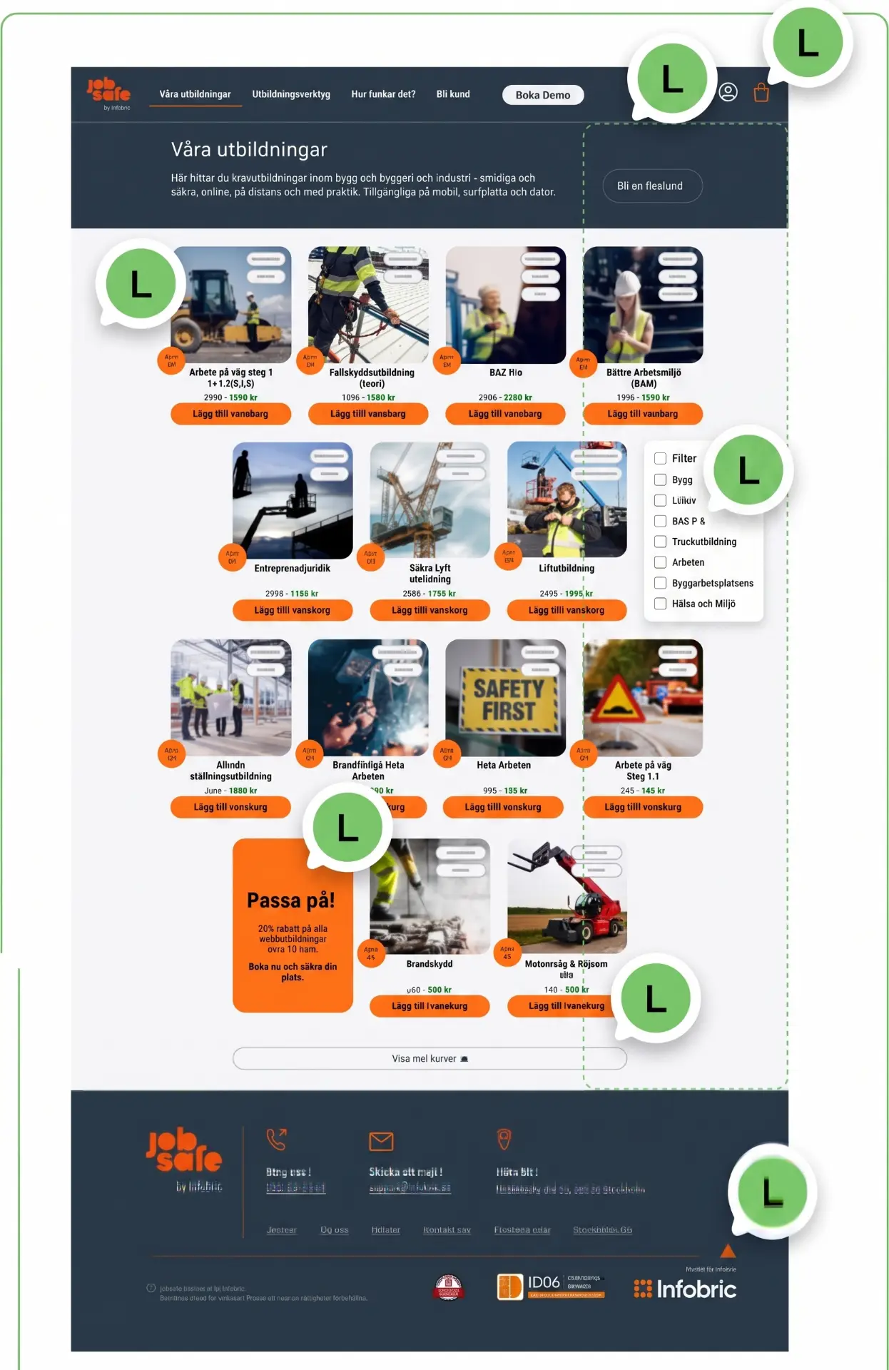
Showing the listing page mockup, 1 of 2.
OUTCOME