FLOX INTELLIGENCE · WILDLIFE MANAGEMENT
Wildlife intelligence.
Flox specializes in AI-driven herding technology, offering a sustainable, humane alternative to traditional wildlife management. Its system uses Gen-AI to identify species in target areas and tailored methods, such as specific sounds, to safely redirect animals away from airports, railways and farms. The design proposal focuses on making that intelligence easier to use: simplifying complex workflows, improving the display of wildlife data and reports, and creating a more accessible, customizable dashboard.
Project overview
- Client
- Flox Intelligence
- Sector
- AI-driven wildlife management
- Scope
- UX research · Ideation · Dashboard design
- Focus
- Data visualization · Accessibility · Customization
UX RESEARCH
Challenges & solutions
01
Complex needs, a clearer experience
- Challenge
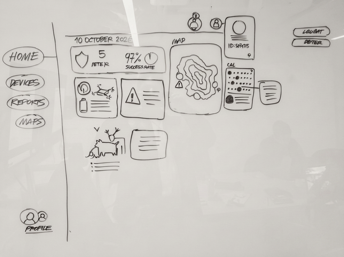
- A diverse user base has complex needs, while the existing design lacks intuitive workflows. Users need to manage wildlife, devices and zones without adding to their workload.
- Solution
- Simplify the experience with accessible design, engaging visuals and intuitive workflows. Begin with ideation and wireframes that organize key information around the user's priorities.
02
Make data easier to act on
- Challenge
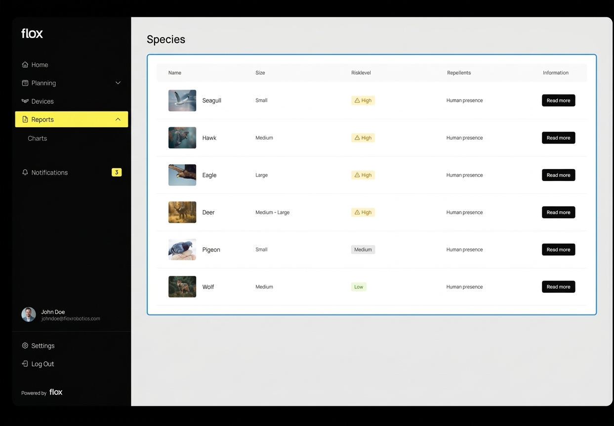
- Reports and data analysis need a more user-friendly display. Heat zones, wildlife documentation and risk information must be easier to read together.
- Solution
- Bring wildlife data into one interactive map with multi-layered heat zones. Add a side chart for navigating data and reports, and link species illustrations to educational content.
03
Simplifying Complexity Through Personalization
- Challenge
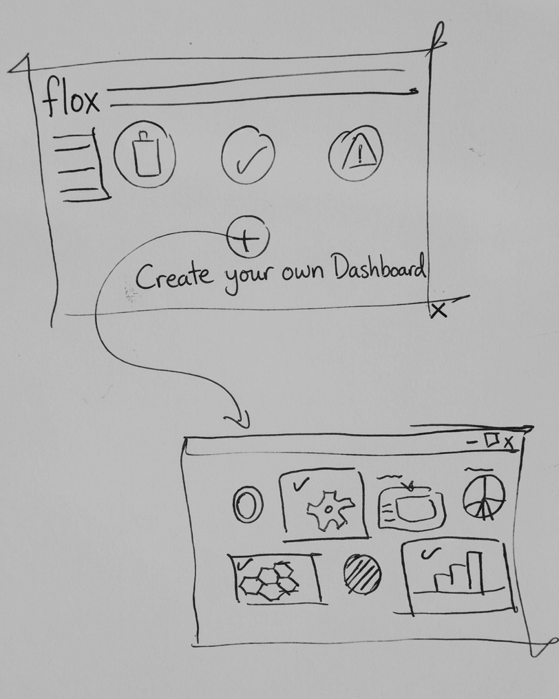
- The platform serves a diverse user base with varying levels of technical proficiency. Its complex UI created high cognitive friction and overwhelmed non-technical users.
- Solution
- Designed a fully customizable dashboard that empowers users to tailor their workspace to their specific workflows and priorities—reducing cognitive load, saving time, and delivering an intuitive, frictionless user journey.
AUDIENCE
Two priorities. One shared goal.
The Flox user seeks a sustainable, cost- and time-efficient tool for wildlife management and monitoring.
Balancing finance & environment
Finance
Goal-oriented and results-focused, Alex prioritizes minimizing costs, reducing workload and preventing damage.
Environment
Solution-focused and environmentally conscious, Max is dedicated to sustainability.
DASHBOARD ANALYSIS
Shifting Perspective
CHALLENGES
-
Complex needs, a clearer experience
A diverse user base has complex needs, while the existing design lacks intuitive workflows. Users need to manage wildlife, devices and zones without adding to their workload.
-
Make data easier to act on
Reports and data analysis need a more user-friendly display. Heat zones, wildlife documentation and risk information must be easier to read together.
-
Simplifying Complexity Through Personalization
The platform serves a diverse user base with varying levels of technical proficiency. Its complex UI created high cognitive friction and overwhelmed non-technical users.
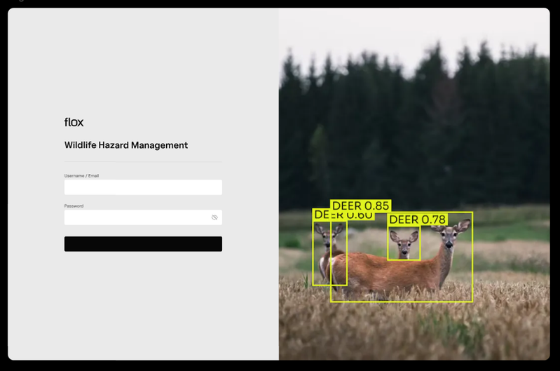
Old design: Login. Image 1 of 5.
PROPOSED FEATURES
Leads to action
- Real-time alerts & notifications
- Clear, actionable wildlife detection alerts, with options to acknowledge, activate deterrents or review details.
- Interactive dashboard
- Customizable widgets for real-time data, historical trends and analytics tailored to each user's priorities.
- Cost & compliance tools
- An ROI calculator for financial insights and a compliance tracker with exportable reports for regulations.
- Intuitive & accessible design
- Multi-platform compatibility, accessibility features, integrated tooltips and onboarding guides.
- Proactive features
- Predictive insights based on historical data, with adaptive settings for environment-specific configurations.
- History & maintenance logs
- A searchable record of past alerts, responses and system maintenance for transparency and troubleshooting.
Clear, actionable wildlife detection alerts, with options to acknowledge, activate deterrents or review details.
Customizable widgets for real-time data, historical trends and analytics tailored to each user's priorities.
An ROI calculator for financial insights and a compliance tracker with exportable reports for regulations.
Multi-platform compatibility, accessibility features, integrated tooltips and onboarding guides.
Predictive insights based on historical data, with adaptive settings for environment-specific configurations.
A searchable record of past alerts, responses and system maintenance for transparency and troubleshooting.
ART DIRECTION
Grounded in the environment
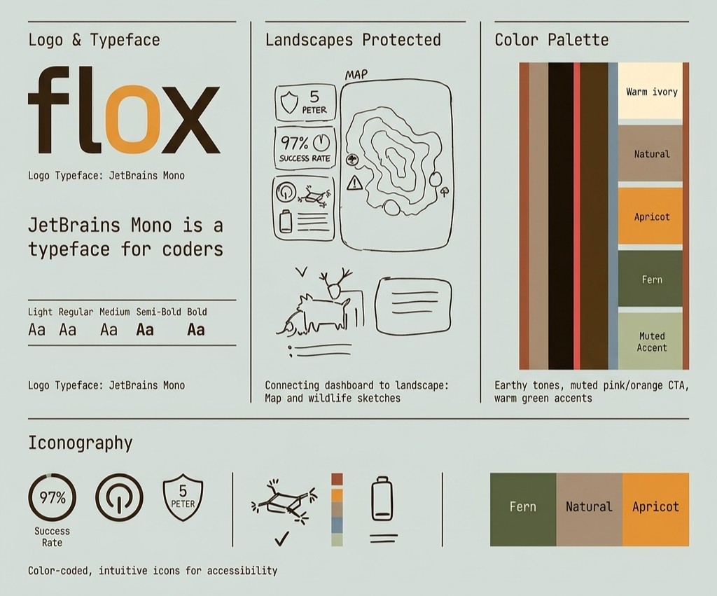
Earthy tones are blended with muted pink and orange for calls to action, neutral beige for easier readability, and warm green as a complementary accent. Color-coded, intuitive icons support accessibility, while the type and visual language connect the dashboard to the landscapes it helps protect.
OUTCOME
Dashboard proposal
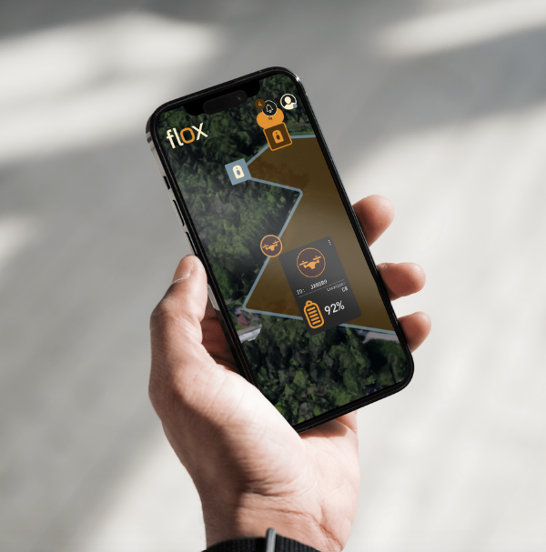
A simple, minimal interface brings zones, devices and notifications into focus. Device overlays reveal status, battery and camera previews, while interactive icons, exploration mode and customizable pop-up windows let users start creating their own dashboard. An ROI calculator adds financial insight alongside the wildlife data.
Different priorities.
An adaptive experience.
An airport employee has different priorities when customizing the dashboard. The experience adapts to those needs, and a mobile-friendly design makes it easier to navigate the area while on the go.